NADbank Website Redesign with Drupal

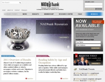
The NADbank website was redesigned to coincide with the launch of the 2011 Readership Study.
With ever growing content the redesign focused on presentation, content display, and content accommodation.
In addition to a spicier layout, the site makes use of transitional sliders to showcase often released updates, a central focus on newsletter registration, membership signup and social media integration.
To support growing content, and with help from our design partners Swerve, we aimed to create a site that focuses visitors towards the major areas of the site. With this focus in mind, we put together a design that subdivides content on the homepage into six logical categories. To offset content we created a left sidebar that showcases registrations, tweets and other important areas of the site.
Once the design was created it was seamlessly integrated with NADbank's existing Drupal platform and browser tested for compatibility with all major browsers and tablets (Blackberry Playbook, Apple iPad and Samsung).
Once tested, trialed and perfected, the site was launched - and a new look for NADbank was born.
Now that you've read about it why don't you go get your read on and visit the site.


